Column Layouts with Divs
This is a somewhat common question in communities like Neocity, indyweb, and other places where people are just starting to learn HTML and CSS, so I figured I'd write something up to be able to quickly show how this works.
So what are we talking about with "column layouts"
More or less, something like the following; where you have <div> elements that are laid out side-by side like columns in a newspaper.
Here's a "3 column" layout:
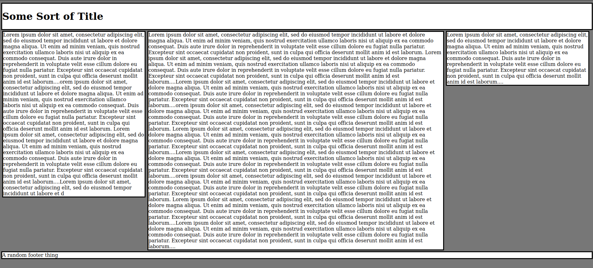
Click to view code
<style>

body{
    background-color:#777777;
}


#left {

    width:24%;

    float:left;

}

#right {

    width:24%;

    float:left;

}

#center {

    width:50%;

    float:left;

}

.container {

    width:cover;
    margin-left:auto;
    margin-right:auto;
}

.banner {
    background-color:#ffffff;
    border-style:solid;
    border-color:#000000;
    width:100%;
    margin-left:auto;
    margin-right:auto;
}

.content{
    background-color:#ffffff;
    border-style:solid;
    border-color:#000000;
    margin:3px;
}

</style>


<div class="banner"><h1>Some Sort of Title</h1></div>

<div class = "container">

    <div class="content" id = "left">...</div>

    <div class="content" id = "center">...</div>

    <div class="content" id = "right">...</div>

    <div style="clear:both;"></div>

</div>

<div class="banner">A random footer thing</div>
Here's a two column:
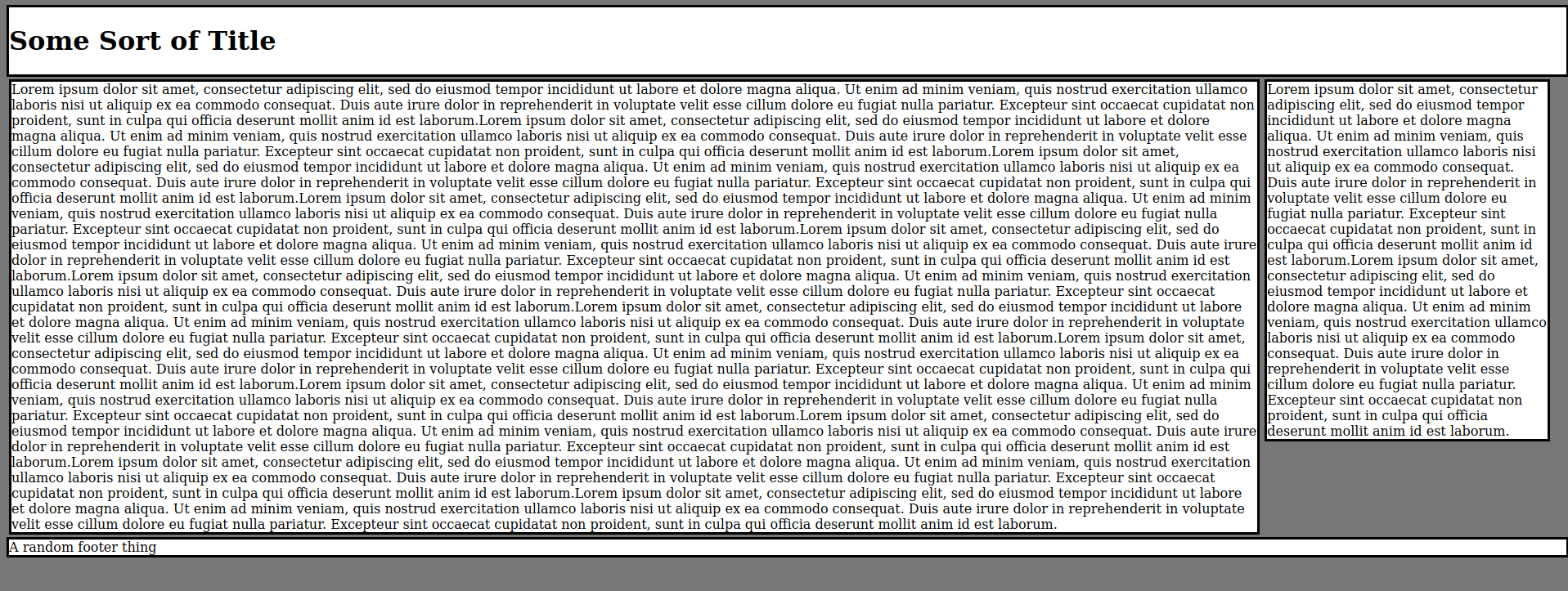
Click to view code
<style>

body{
    background-color:#777777;
}


#left {

    width:80%;

    float:left;

}

#right {

    width:18%;

    float:left;

}


.container {

    width:cover;
    margin-left:auto;
    margin-right:auto;
}

.banner {
    background-color:#ffffff;
    border-style:solid;
    border-color:#000000;
    width:100%;
    margin-left:auto;
    margin-right:auto;
}

.content{
    background-color:#ffffff;
    border-style:solid;
    border-color:#000000;
    margin:3px;
}

</style>


<div class="banner"><h1>Some Sort of Title</h1></div>

<div class = "container">

    <div class="content" id = "left">...</div>


    <div class="content" id = "right">...</div>

    <div style="clear:both;"></div>

</div>

<div class="banner">A random footer thing</div>
More or less, the above should get across what we're talking about -- <div>s next to other <div>s.
Right.
The problem
You could accomplish this with absolute positioning, but that's a bad idea that fails at adaptive design -- your page will break on unexpected resolutions!
So what do we do? Floats and percents, obviously, but if we just go for it, many people end up with this issue:
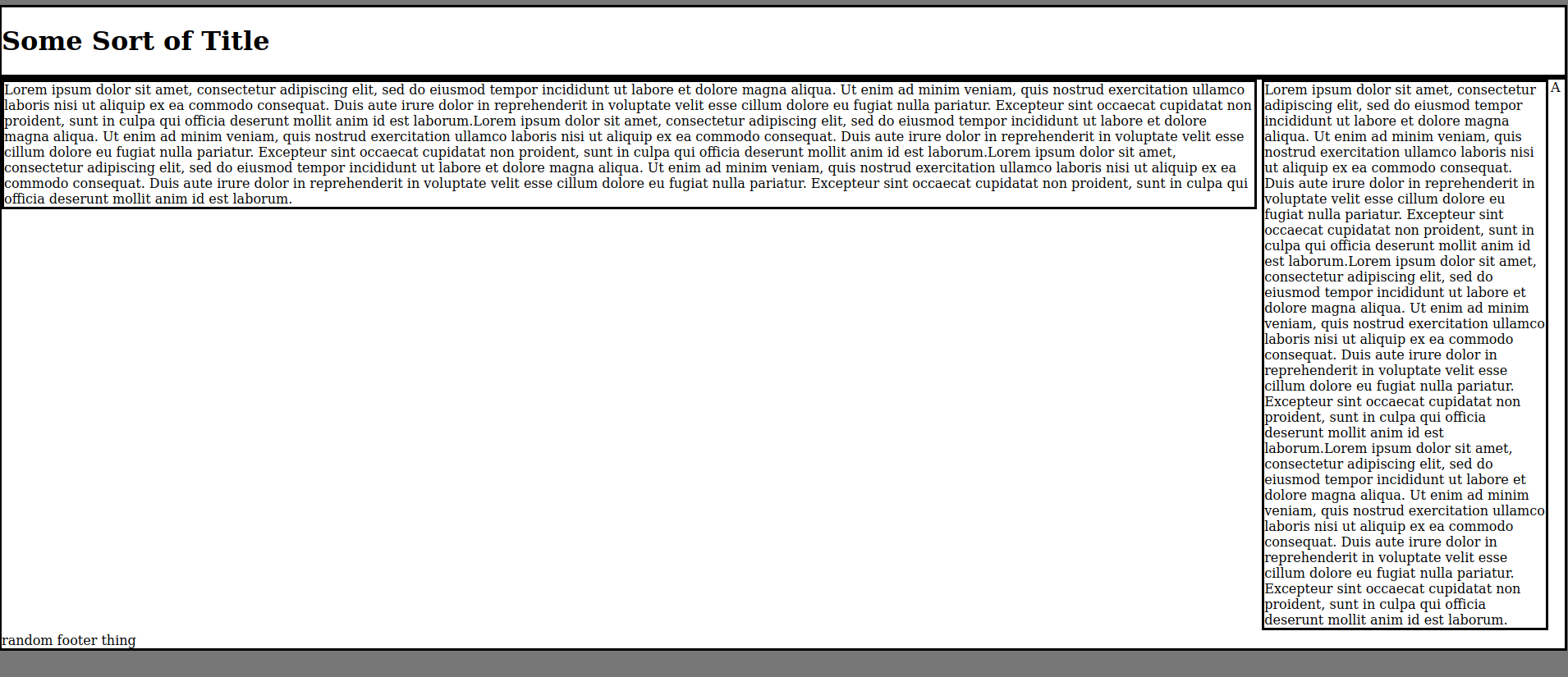
Notice how the footer <div> has sorta expanded and risen up to be just under the header with the "title" in it. This happens because floating an element causes it to be removed from the document flow, which means that the "header" and "footer" are considered to be right on top of each other.
So how do we fix this?
The magic here is pretty simple. Looking at the three column example:
<div class = "container">

    <div class="content" id = "left">...</div>

    <div class="content" id = "center">...</div>

    <div class="content" id = "right">...</div>

    <div style="clear:both;"></div>

</div>
To get the basic structure up, we need a container <div>, the 3 "content" <div>s that will form up the columns, and then a final "dummy" <div> with the style clear:both; set for it.
Once we have this HTML setup, all we really need to do is style the content class to float to the left, and adjust the widths and other box-model properties of the individual <div>s to our liking.
Why does this work?
When we apply a float property to an element, it gets removed from the "document flow", which means it more or less doesn't take up space like a block element usually should. That's why the footer "collapsed" upwards in the "broken" example above. Our clear:both; dummy <div> effectively is an invisible "floor" -- clear:both; is telling the browser to ensure that nothing goes on either side of that block element, and so the floating <div>s are forced to behave the way we want them to.